JDouglas
Branding, Guidelines, Environmental
2016
JDouglas is a full-service, to-the-trade representative agency providing the highest quality goods and customer service to retailers and interior designers. With some of the industry’s leading manufacturers, they offer a wide array of high-end furniture, décor, lighting and more — making them, truly, “A Marketplace for Design.”
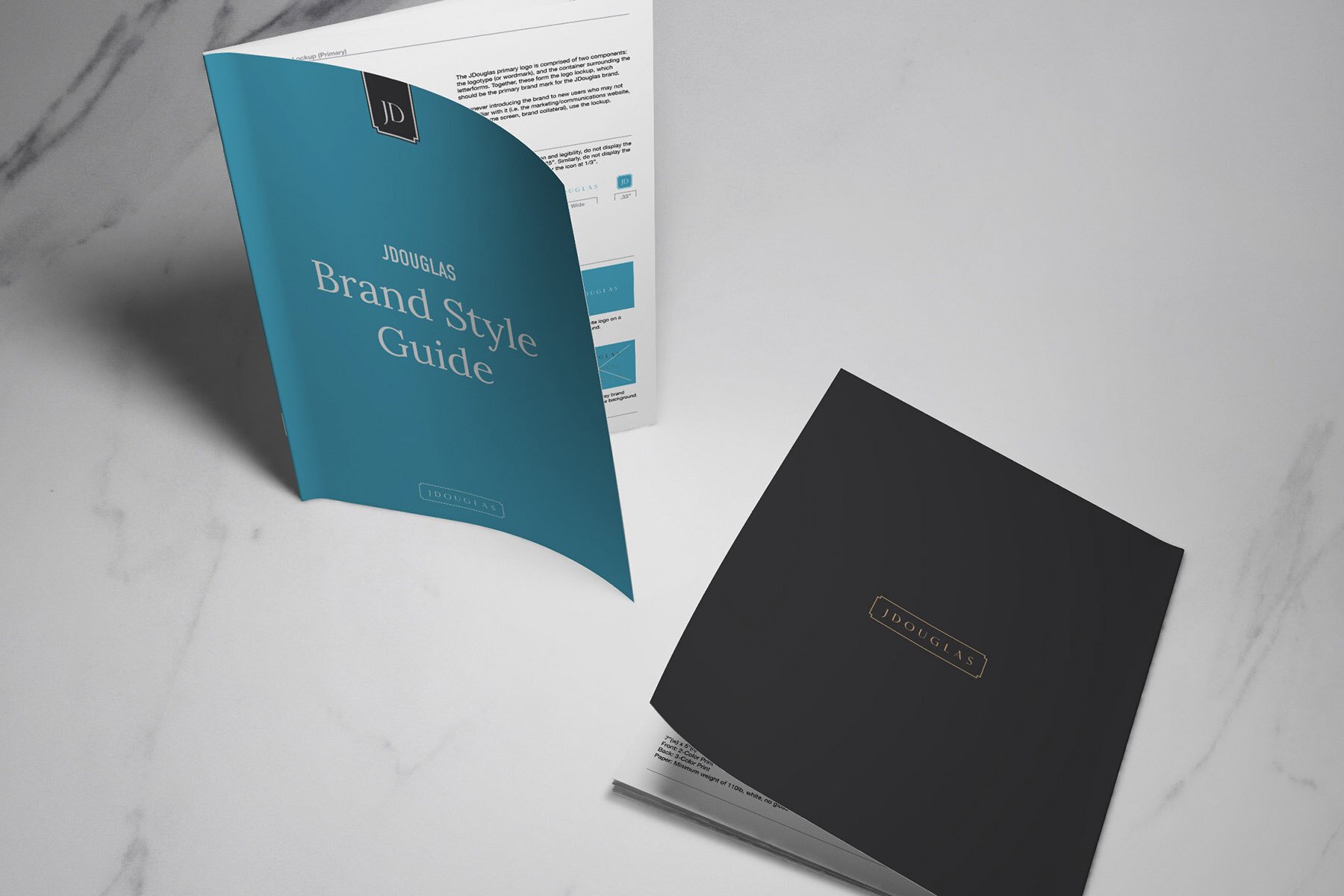
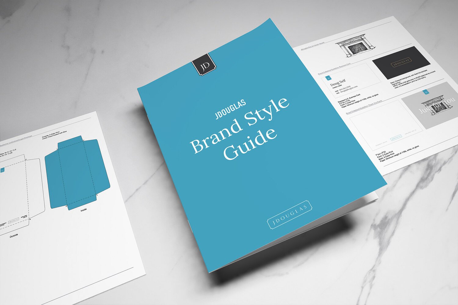
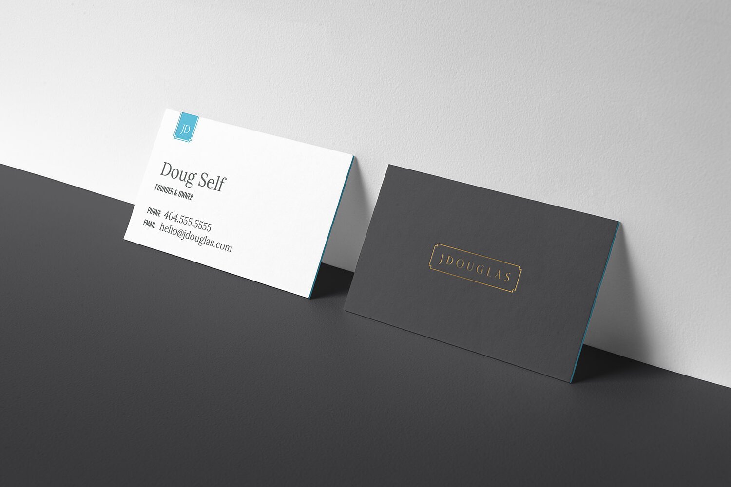
Led by the renowned interior designer Doug Self, JDouglas is well-known for great design, but also for kindness and customer service. But the old brand image was a bit stayed and didn’t deliver on a look-and-feel that resonated with the brand’s desired personality of premium-quality. So Doug reached out to work with me on crafting a new brand image — a new logo that spoke to a more regal look, a refined color palette and system of fonts, and new marketing collateral that brought it all together. Once we landed on the final assets, I hosted a brand reveal presentation at a staff retreat.
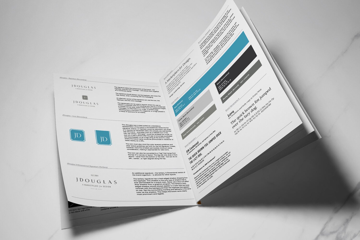
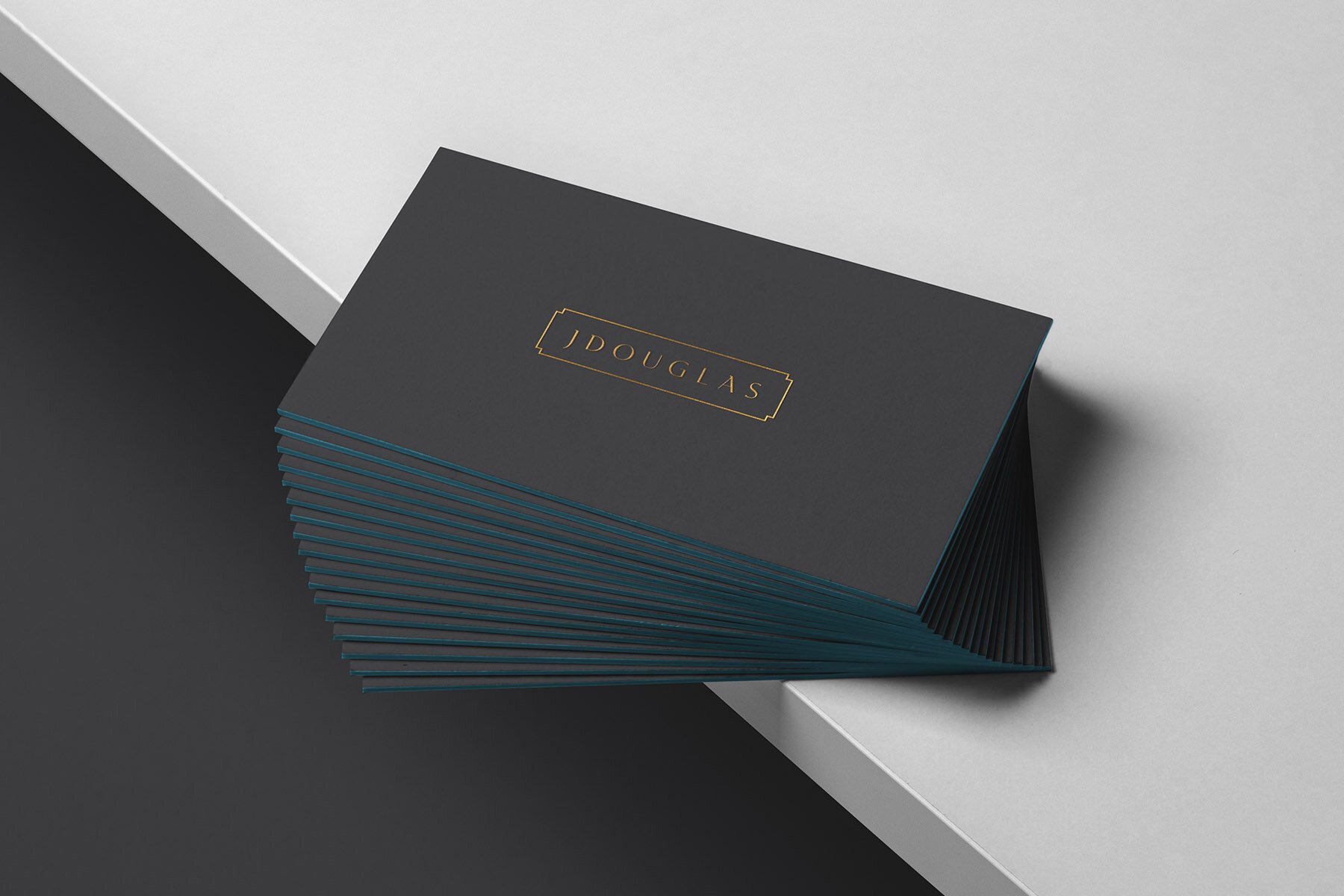
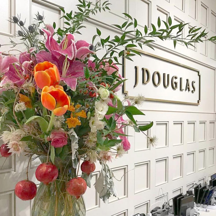
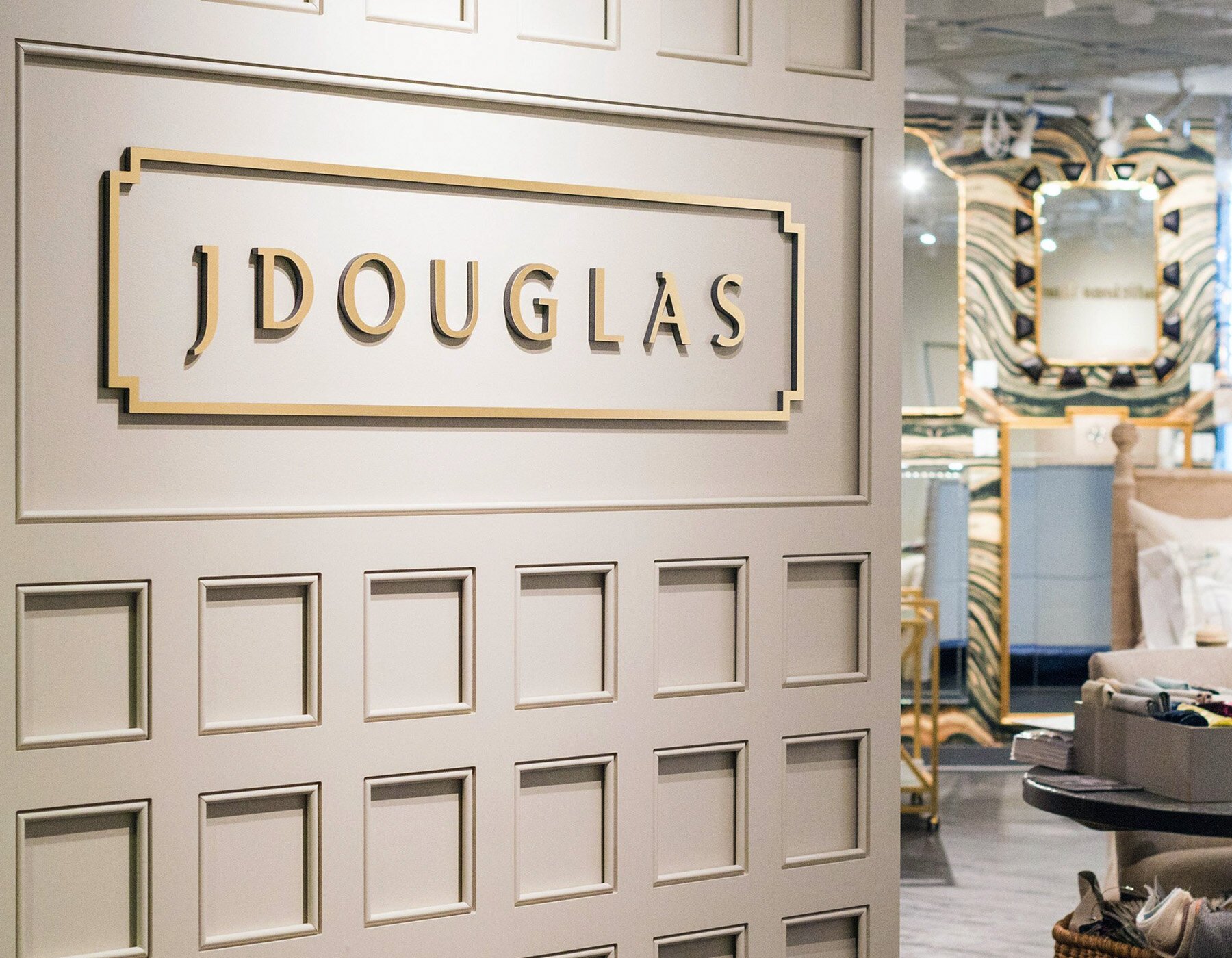
The logotype itself is a custom typeface that has deco-like qualities that echo the brand personality inspiration of Jacqueline Kennedy and Frank Sinatra. The wide tracking drives home this regal look-and-feel, as well as the housing enclosure of a sharp, beveled edge container. It is both modern and established-feeling at the same time.
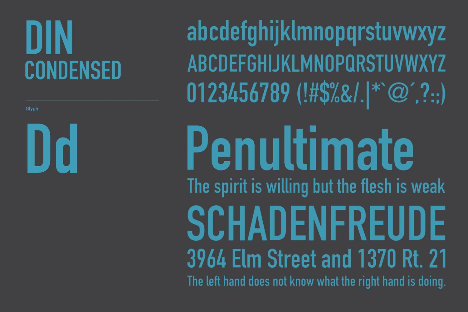
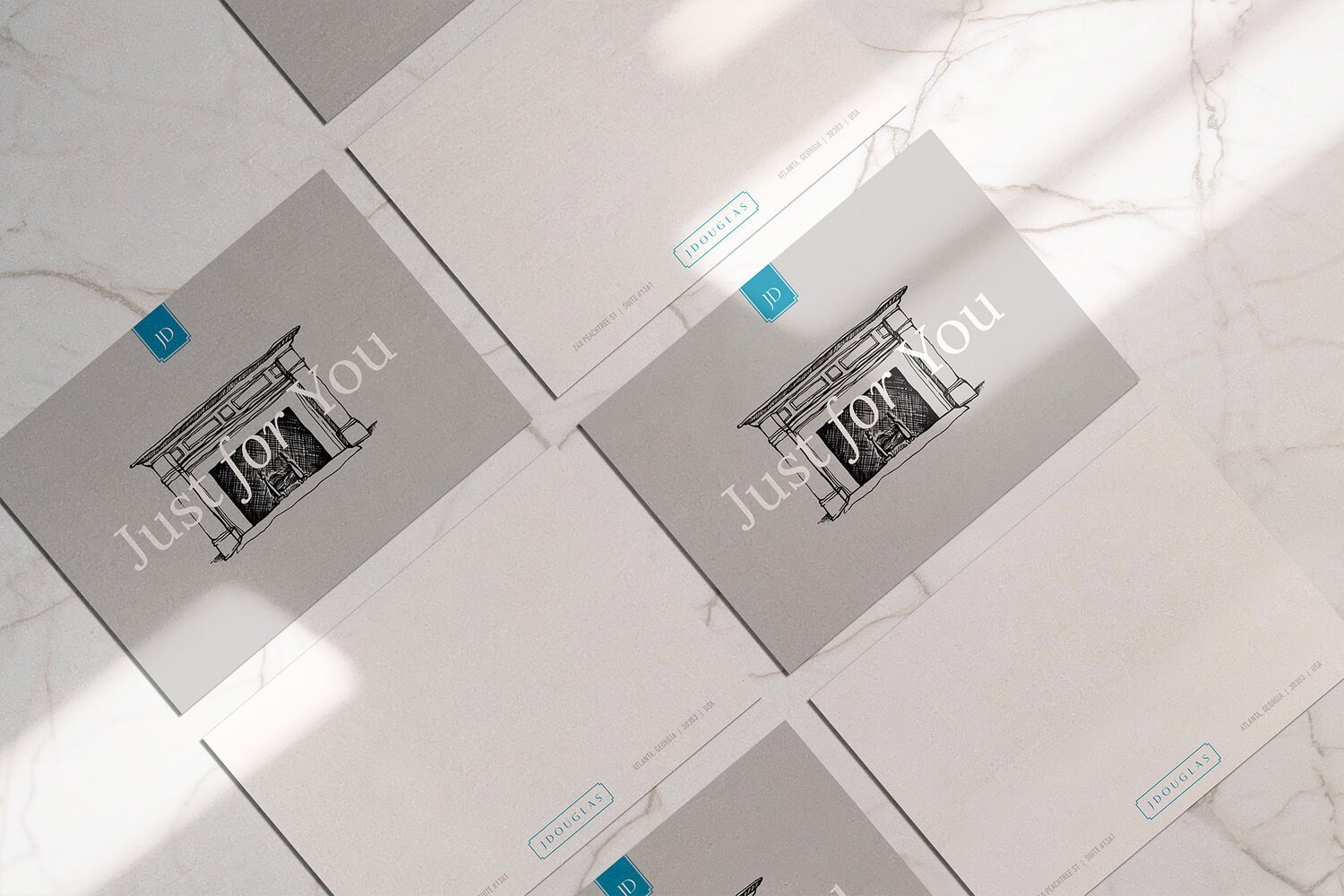
The brand previously used a teal-blue, but it was a bit of a more juvenile hue. We enriched the blue with more saturation and a bit less of a green tint and added a series of neutral grays and deep charcoal colors around it to update the overall look. I also hand-illustrated a fireplace that acts as a piece of key artwork for the brand, representing the idea of a home’s hearth and standing for an image of welcoming and warmth.


