The Common Cure
Branding, Naming, Messaging
2017
A Friendly Neighborhood Joint.
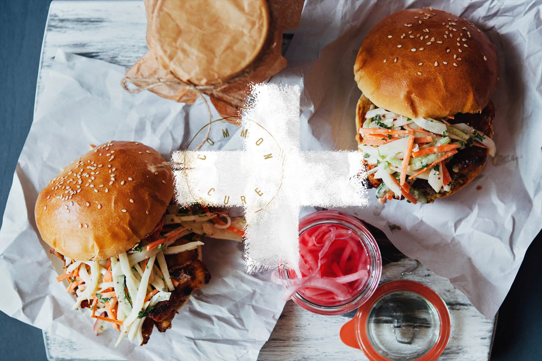
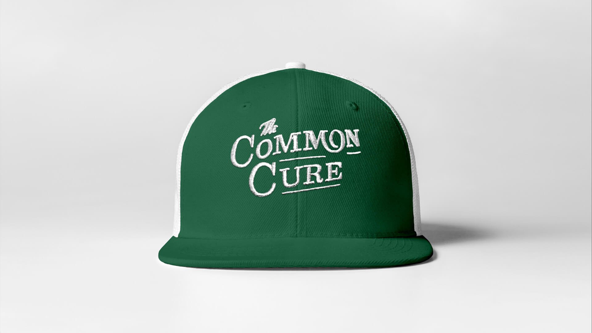
After partnering together on the branding for Oakblue Kitchen, when restaurant owner John Ko approached me about adding another venture to this new family of restaurants, I leapt at the chance. We worked together to craft a brand identity for The Common Cure – a neighborhood-centric casual bar and grill, located in a building that used to be a pharmacy in generations past, just off of Augusta Road in Greenville, SC.
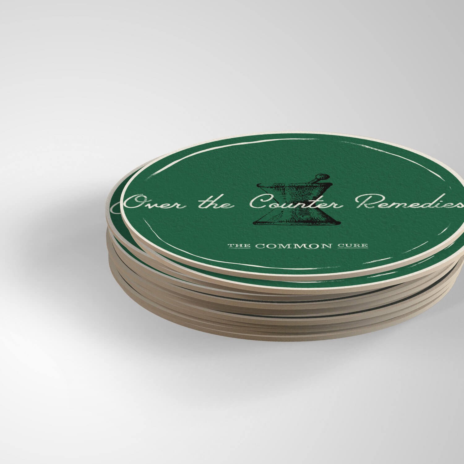
The location for the restaurant was full of history, once housing Campbell's Pharmacy, a soda fountain and counter-service shop. The branding – from the name, The Common Cure, the messaging, "Over The Counter Remedies," the illustrated pestle and mortar – would pay homage to the venue's roots, while expanding and becoming something unique and new as well.
(Above: historical moodboard and inspiration)
Credits
Client
The Common Cure, Greenville SC
Owner
John Ko
Art Director, Designer, Illustrator
Russell Shaw
Photography
commoncure.com and Eleanor Rogers of The Upstate Foodie
Recognition
Featured Project: Behance's Curated Gallery: Graphic Design
Featured Project: The AIGA Member Gallery


