Work is Play Studio
Branding, Design, Web
2024
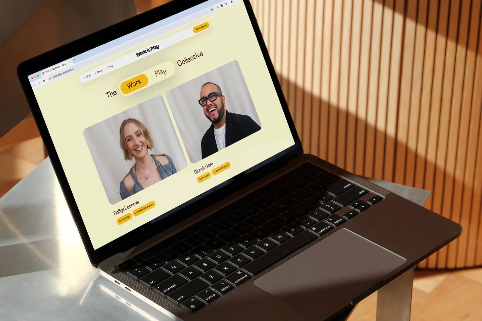
Work is Play Studio is a fun-sized, full-service design studio on a mission to bring more joy to design. Founders Sofya Leonova and Dinesh Dave built their studio on the belief that original, impactful work is best created with a healthy dose of play.
Working with Sofya and Dinesh to bring the Work is Play visual identity to life was a real treat. Together, we created a flexible and dynamic identity system—built around a custom-wordmark, we created dozens of artistic iterations and creative variations on the words “Work” and “Play” that alternate in animation or interaction. The motif of “Expect the Unexpected” weaves its way through the entire system and web experience to bring subtle moments of thoughtful surprise and delight.
The success of the project relied on a great collaboration—with Sofya and Dinesh giving creative direction, partnering with the talented Kyle Kelly-Yahner for messaging and copywriting, and working with the incredible engineers Tatiana Mac and Connor White to bring the website to life.
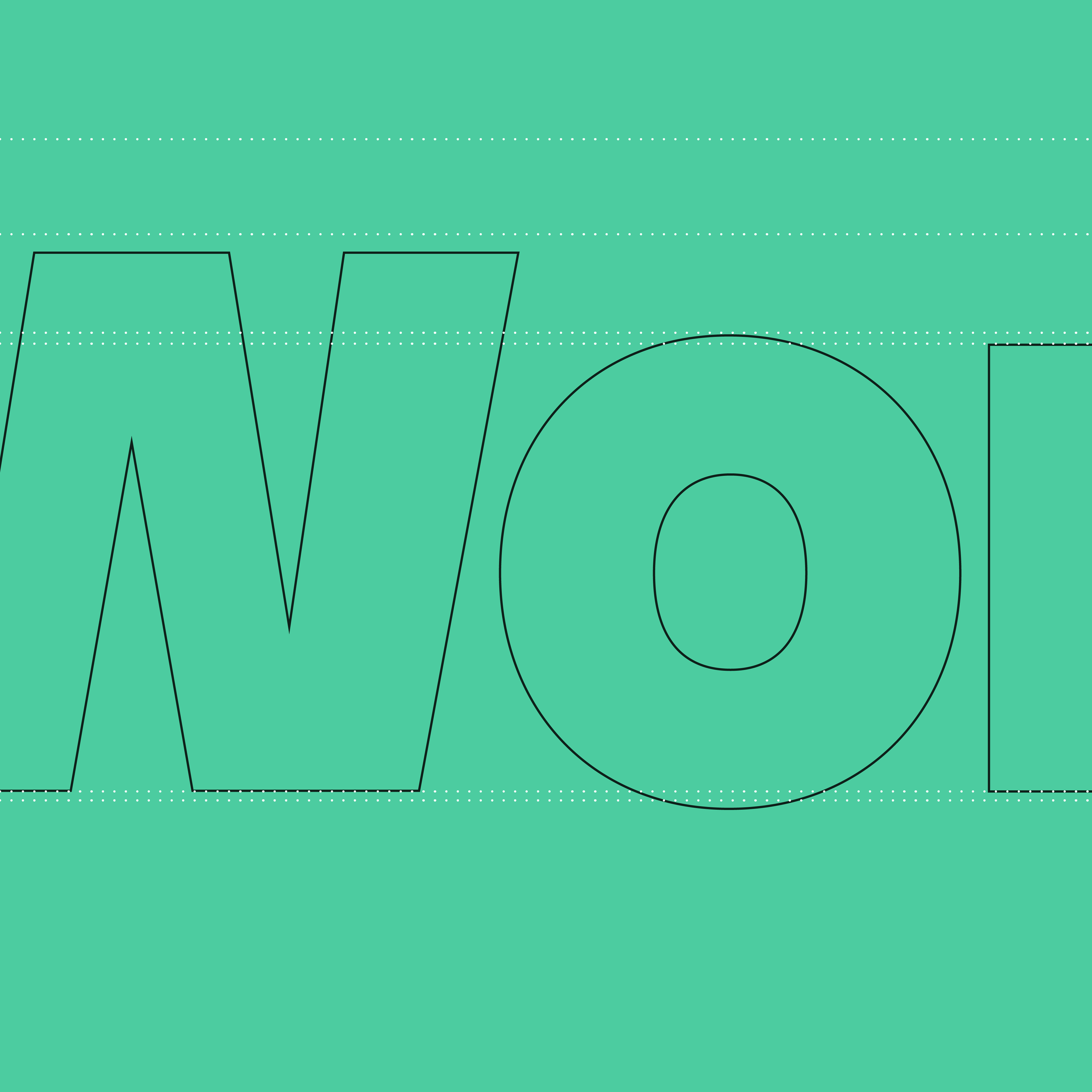
The custom wordmark is a clean and crisp set of letterforms that are playfully chunky and have just the right amount of character—like the kickstand base of the lowercase “k” or the oversized dot above the lowercase “i”.
The logo positions them nicely as a modern design studio with enough of a “wink” to own the term joy agency.
Flexible, Dynamic Logo System
One of my favorite aspects of the brand is its ability to morph and change shape through microinteraction and animation. The logo was designed to be very clean and simple, so that it can rotate through creative and artistic variants of the word “Work” and “Play” to infuse discoverable surprise and delight throughout the identity.
Web Design
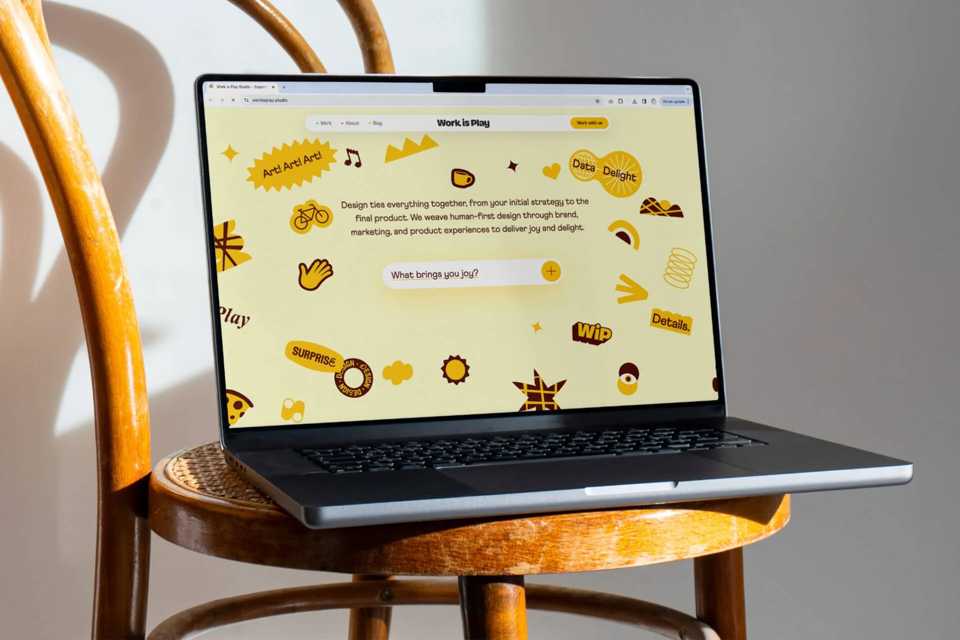
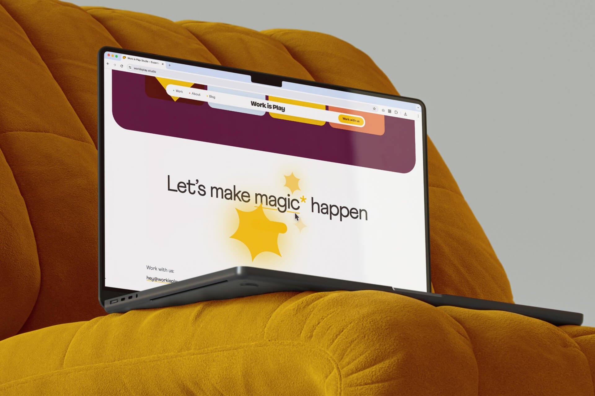
The motif “Expect the Unexpected” weaves through the site design—hovering over the word “Joy” on the homepage launches animated stickers and graphics, while scrolling triggers a re-sizing of the studio’s design reel.
Another favorite microinteraction: when a user hovers over the logo in the site’s navigation, it randomly displays one of the logo variables to bring a subtle moment of delight!
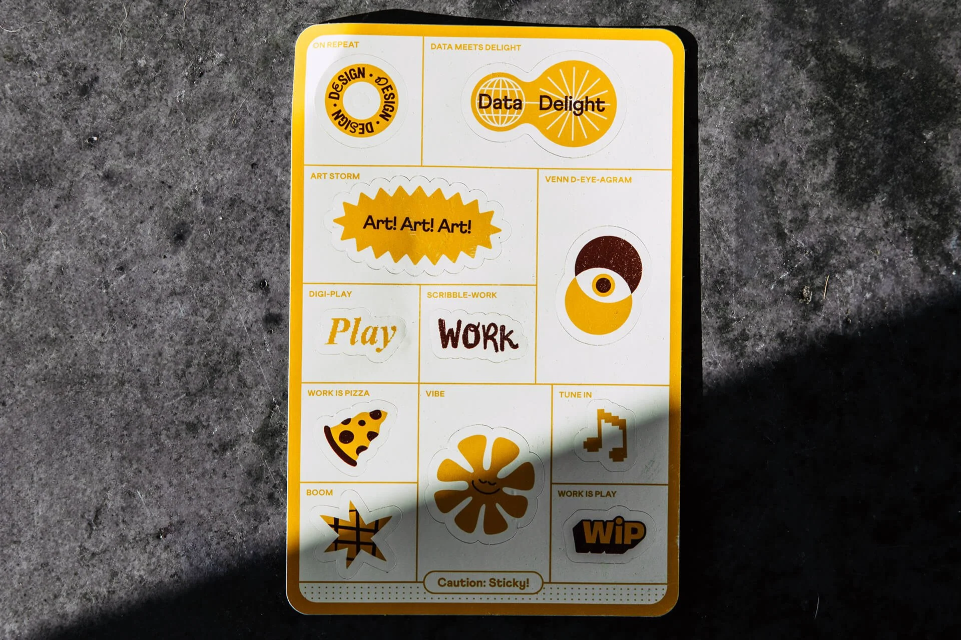
The homepage also features a component that we lovingly refer to as the Joy Wall: an interactive place where the user can push and move around the branded stickers on the page, and even an input field where they can add words or ideas that bring them joy to the wall.
The website uses a custom component we call the Expandopanel to display work and blog posts in a fun and interactive way: hovering over a pane expands it, while shrinking down the others.
Toggles give a nod to the notion that work can also be play, and vice versa. On the studio’s Work page, the user can toggle to a “Play” view that shows a different set of creative projects.
When users hover over the word “magic” in the footer, a field of stars and sparkles burst forth.
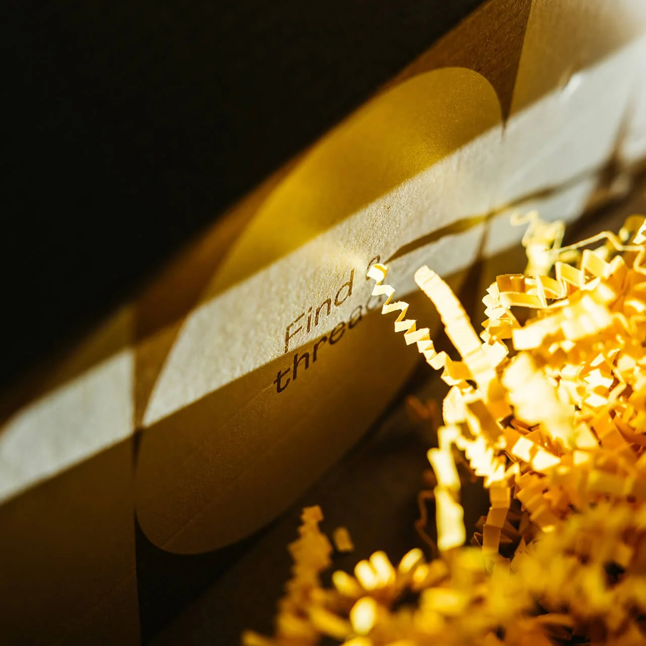
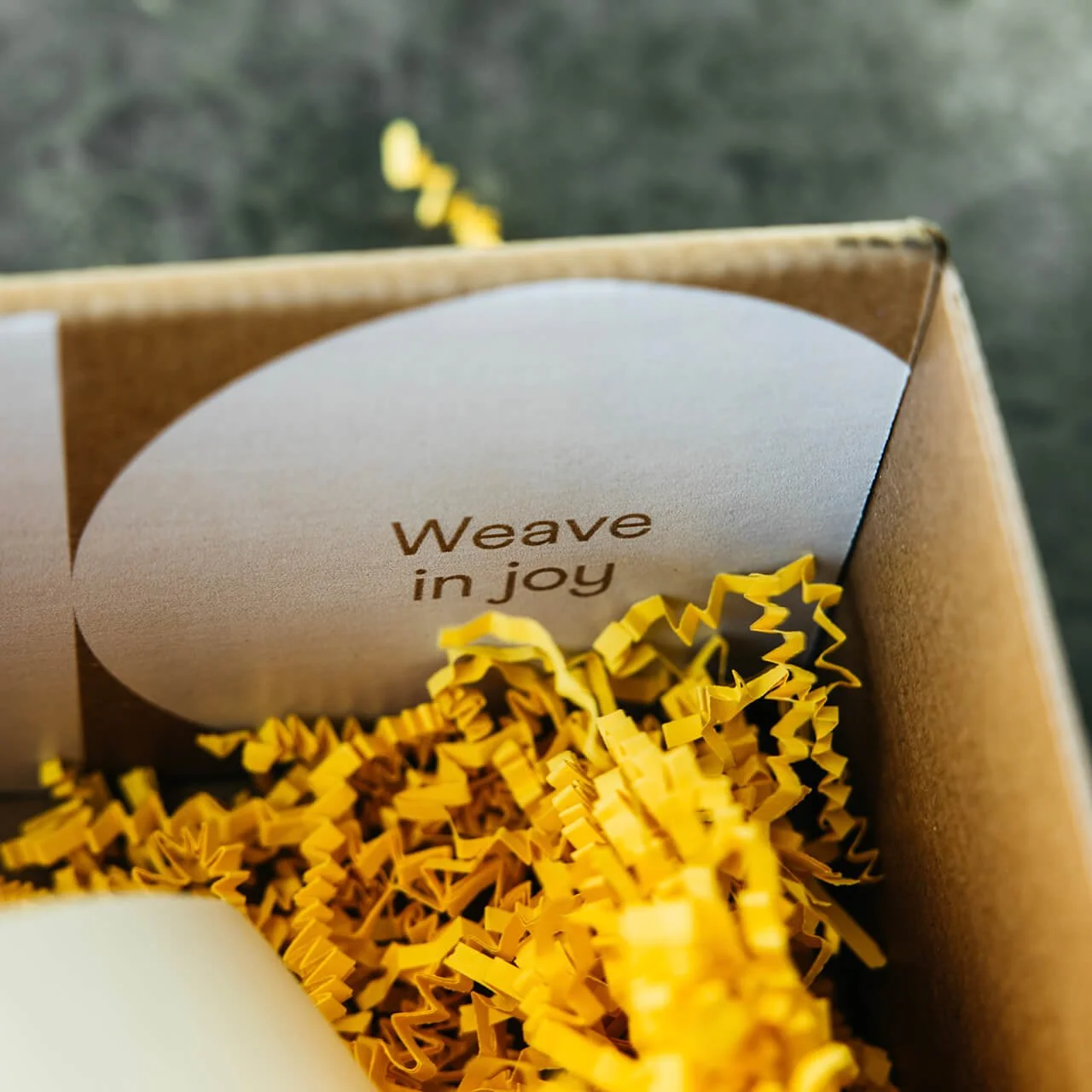
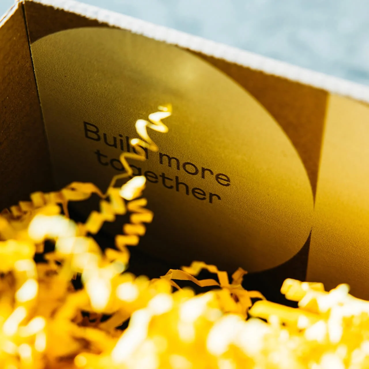
The firm’s values (Find a Thread; Weave in Joy; Build More Together) are displayed on cards that can be expanded/flipped.
We even created a little, visual xylophone for the user to play with alongside stats about the studio.
Launch Materials
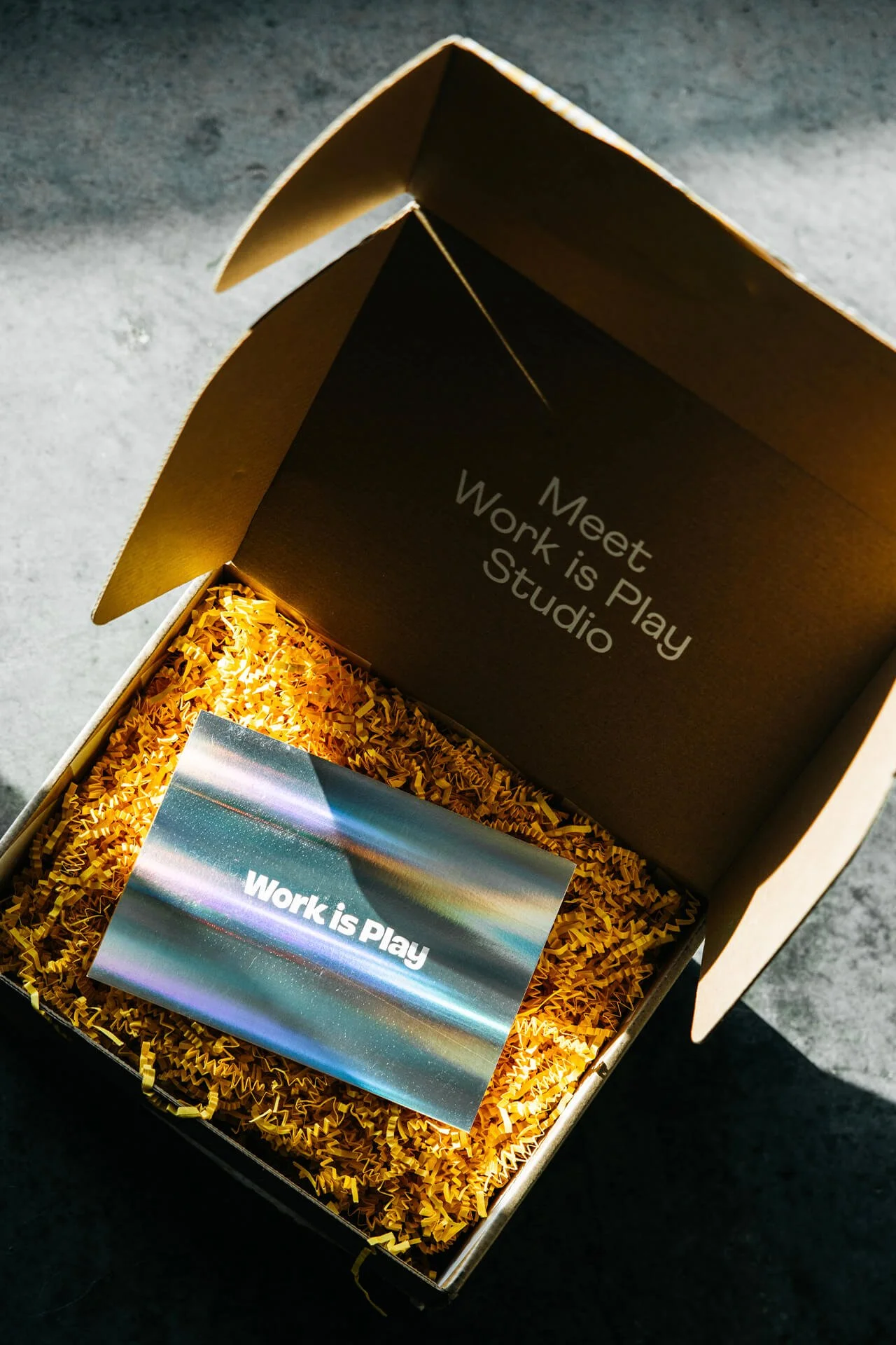
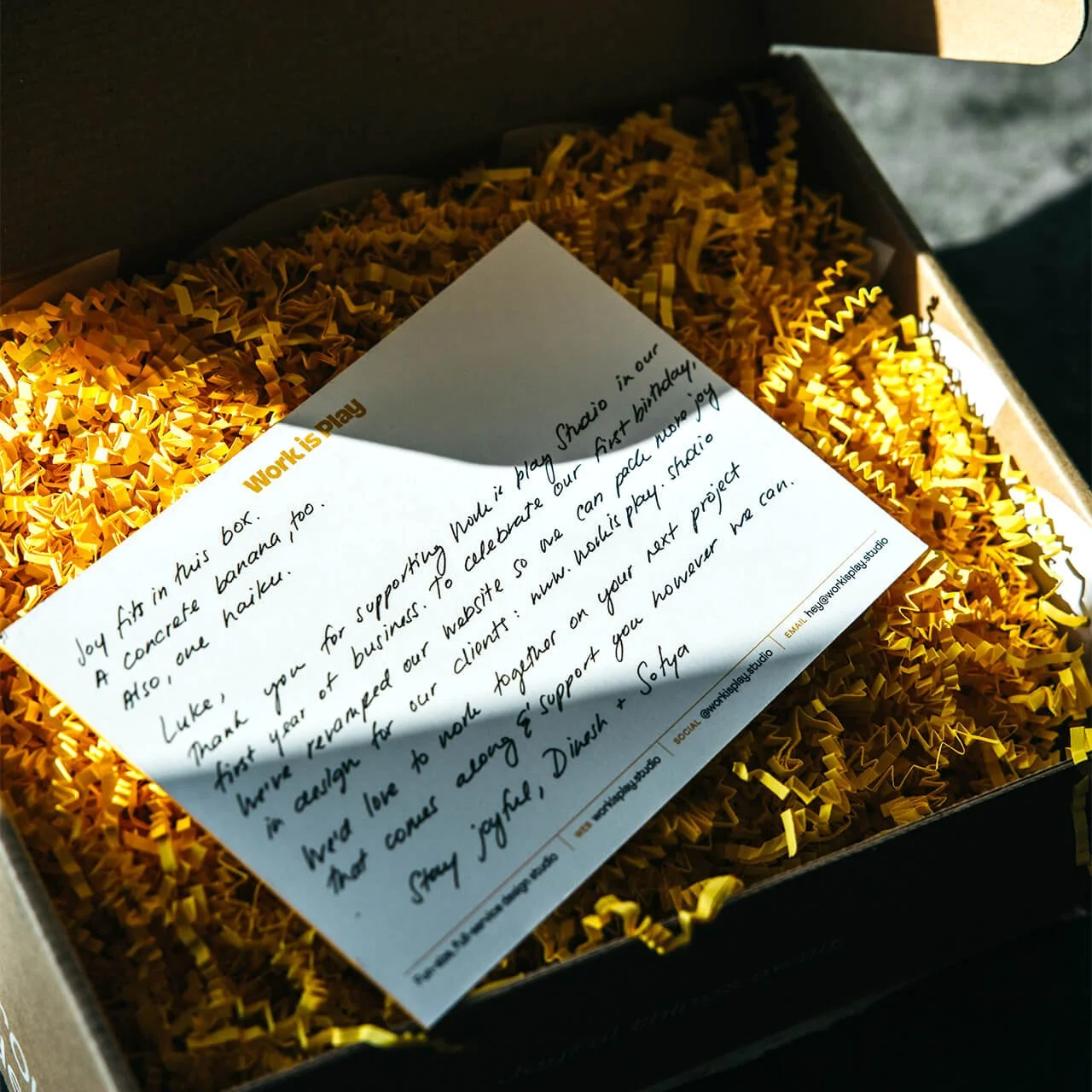
For the launch of the studio’s new visual identity and website, we partnered on a physical gift that was mailed out to creative co-conspirators, collaborators, and prospective clients.
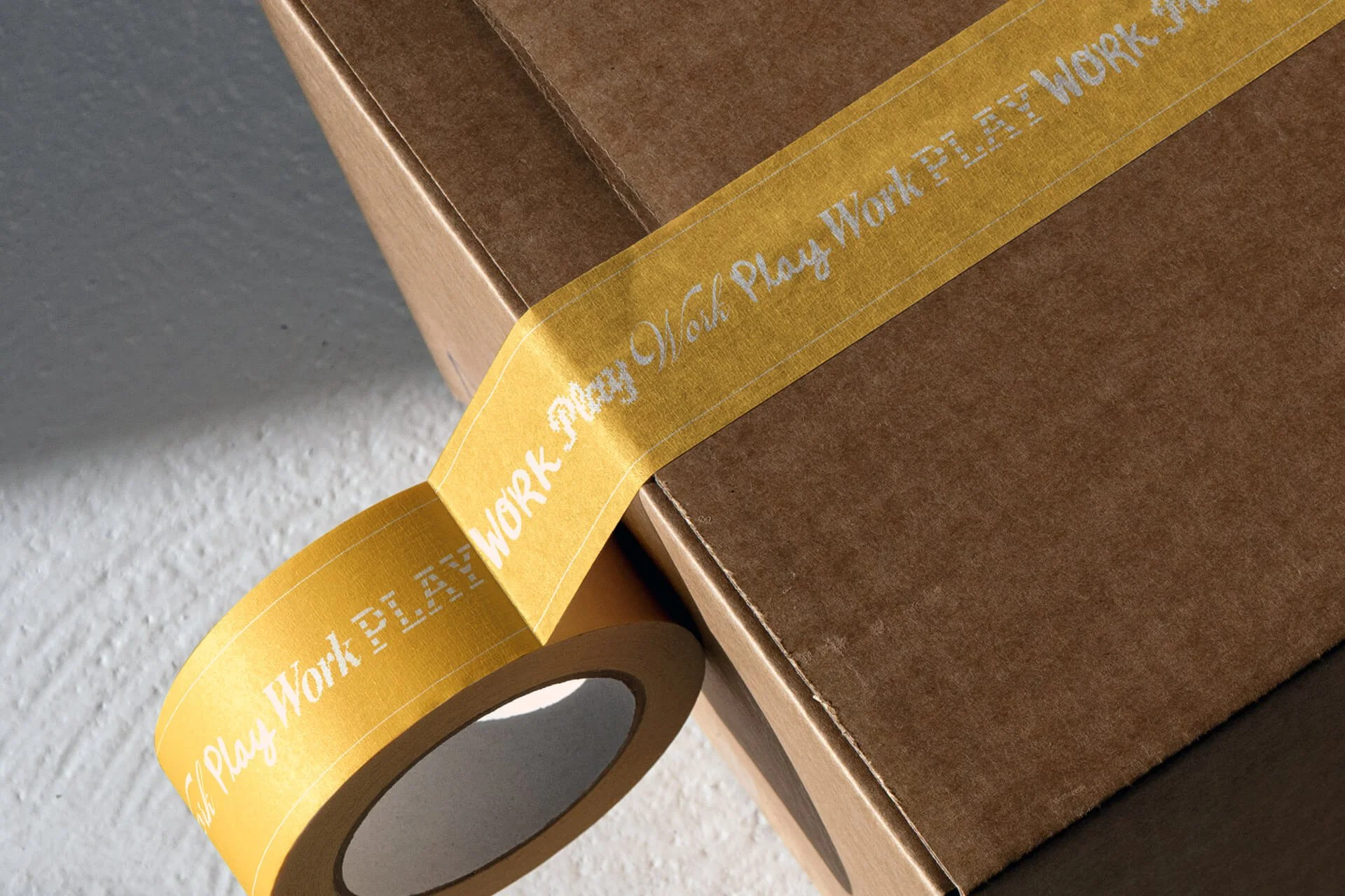
The custom-designed box featured a space to write in the recipient’s name on the outside, sealed with a custom tape that cycles through the design variants for “Work” and “Play.” Inside, the box design features the studio’s values.
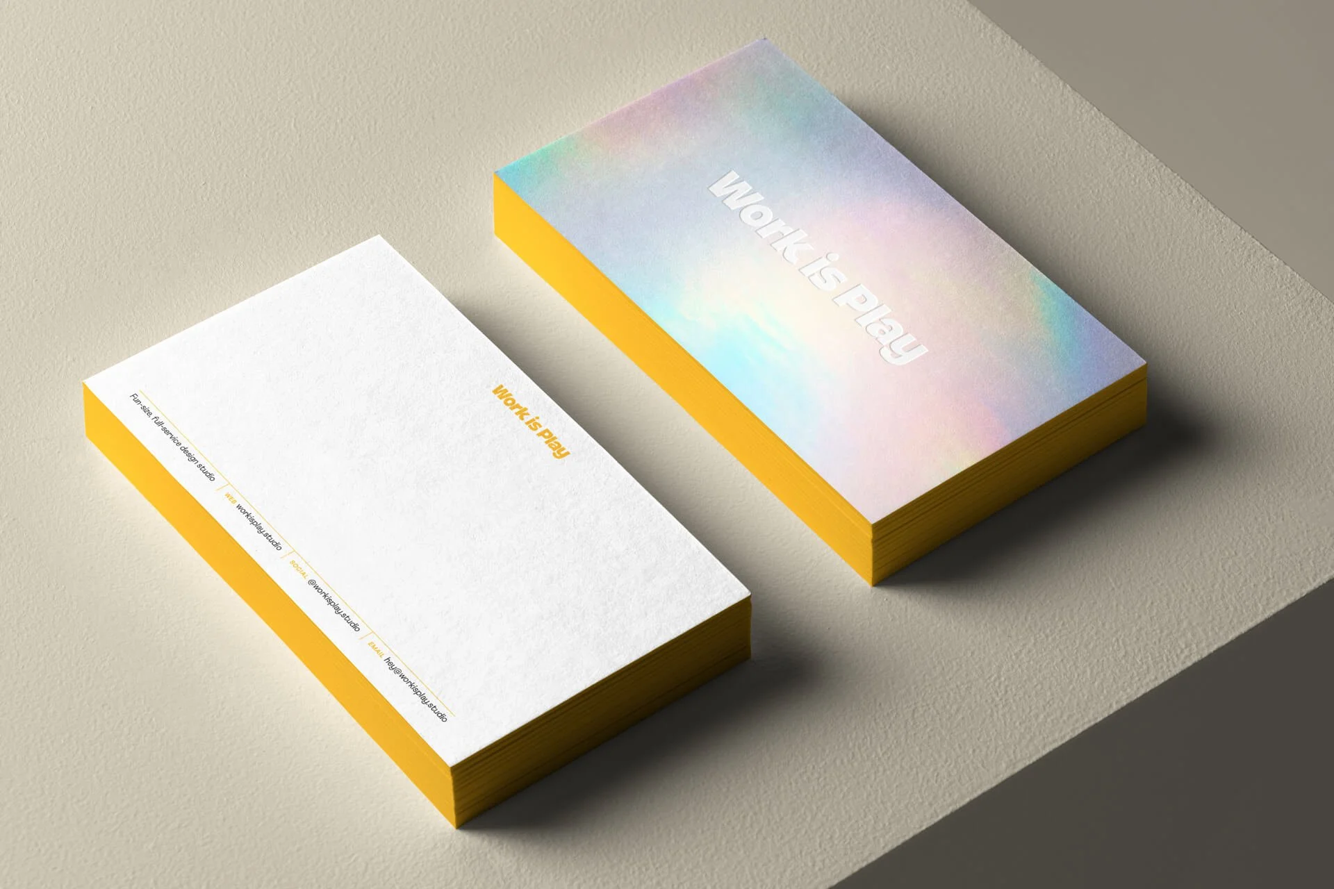
Sitting on a mound of gold-colored crinkle paper, we designed a custom notecard with the logo debossed on a field of holographic silver. The box contained a book, Joyful: The Surprising Power of Ordinary Things to Create Extraordinary Happiness; a set of branded stickers (inspired by the website’s Joy Wall); and a concrete yellow banner sculpture that featured a “WiP”-branded fruit sticker design.


